
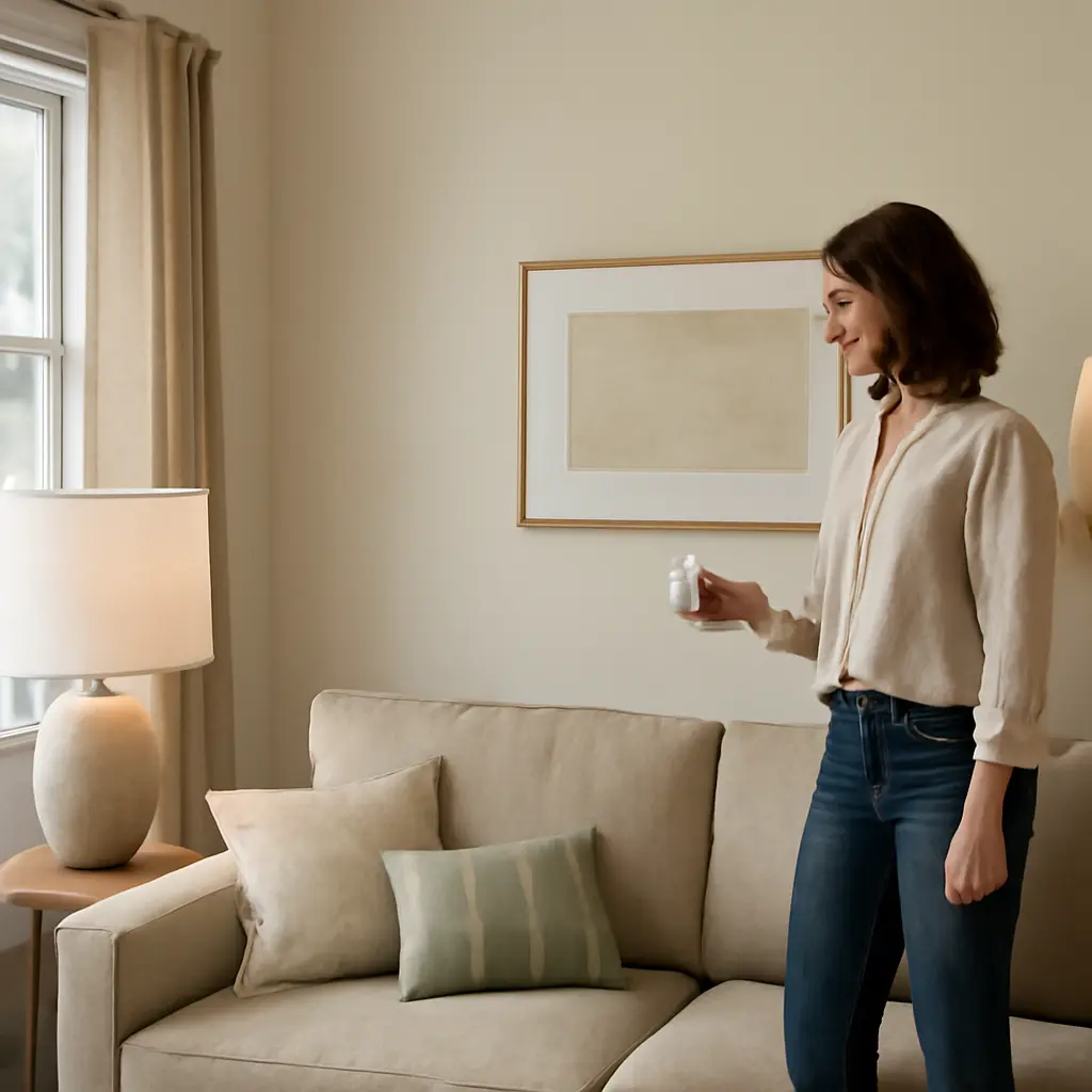
Interior designers treat mood lighting as a deliberate balance of brightness, color, direction, and control—not simply a choice of attractive lamps. The Illuminating Engineering Society (IES) recommends lighting levels according to the task and setting, while research summarized by the U.S. National Library of Medicine links light exposure to the body’s circadian timing and alertness. The practical takeaway: layer ambient, task, and accent light; choose color temperature with the room’s purpose in mind; reduce glare; and use dimmers and controls to adjust the scene over time. These principles can make a room more comfortable and useful without relying on a single “perfect” bulb.
Mood lighting is a layered lighting strategy
Mood lighting is the planned use of illumination to shape how a space looks and feels while supporting the activities taking place there. It is not a technical term with one universally accepted definition. In practice, designers use it to describe the combined effect of light level, distribution, color appearance, contrast, and control. The National Electrical Manufacturers Association (NEMA) and IES both emphasize that lighting quality depends on more than the lamp’s stated brightness: where light falls, how it reaches the eye, and how it relates to the room all matter.
Designers commonly organize residential lighting into three complementary types: ambient, task, and accent. A layered plan provides flexibility; a single overhead fixture often cannot create comfortable general illumination, support close work, and highlight architectural features at the same time.
Ambient lighting establishes the base layer
Ambient lighting is the general illumination that makes a room navigable. It may come from ceiling fixtures, recessed lights, wall sconces, or reflected light from a cove or ceiling. Designers aim for reasonably even coverage without making every surface equally bright. A room with some gentle contrast usually feels more dimensional than one flooded uniformly from above.
For a living room, for example, a dimmable ceiling fixture or indirect cove light can provide a comfortable baseline. Smaller lamps then supply focused pools of light. Lighting recommendations vary by task and standard, so there is no single brightness figure that suits every living room; the important test is whether people can move comfortably and see without squinting or feeling exposed to glare.
Task lighting puts light where work happens
Task lighting is directed illumination for activities such as reading, cooking, grooming, or working at a desk. A desk lamp, under-cabinet kitchen light, and bathroom mirror light are common examples. The IES develops recommended illuminance levels for specific visual tasks; its guidance reflects the fact that detailed work generally needs more light than casual movement through a room.
Placement matters as much as output. A reading lamp should illuminate the page without shining directly into the reader’s eyes. At a kitchen counter, light positioned beneath upper cabinets can reduce shadows cast by the person working. Designers also consider the user’s handedness and likely standing or seated position when deciding where fixtures belong.
Accent lighting creates focus and depth
Accent lighting draws attention to a feature—such as artwork, a textured wall, shelving, or a plant—by making it brighter than its surroundings. Wall washers, picture lights, and adjustable spotlights can all serve this role. Accent light is most effective when it supports a clear focal point rather than competing with several equally bright objects.
This layer also helps prevent a room from feeling visually flat. A designer might combine soft ambient light with a warm table lamp and a narrow beam on artwork. The contrast gives the eye places to rest and move, while dimming keeps highlights from becoming harsh.
Color temperature and color rendering change the mood
Two light sources can have similar brightness yet make a room feel very different. Designers distinguish color temperature from color rendering: correlated color temperature, measured in kelvins, describes whether light appears warmer or cooler, while the color rendering index (CRI) estimates how faithfully a source reveals colors compared with a reference. Neither measure alone guarantees that a bulb will look good in a particular room, but together they help narrow choices.
Warm and cool white suit different visual settings
Warm-white light generally appears more amber; higher color-temperature light appears whiter or bluer. Many residential LED products offer selectable color temperatures, commonly spanning roughly 2,700 K to 5,000 K, though exact ranges differ by product. Warm light is often chosen for relaxing living areas and bedrooms, while a more neutral white can be useful where accurate visual judgment is important, such as a kitchen work surface or home office.
These are design tendencies, not rigid rules. Daylight, wall color, wood finishes, and the viewer’s preferences all affect how a source appears. A useful practice is to test bulbs in the actual room and at the time of day they will be used. A sample that looks pleasant in a store can appear stark against warm-colored paint or noticeably different beside another lamp.
Color rendering affects finishes, food, and skin tones
CRI is a measure of how closely a light source renders a set of colors compared with a reference. The U.S. Department of Energy explains that a higher CRI generally indicates more accurate color appearance, although the score does not describe every quality of a light source. Designers pay particular attention to color rendering in bathrooms, kitchens, dressing areas, and rooms with distinctive finishes or artwork.
When comparing products, look for a CRI of 90 or higher where color accuracy is a priority, while recognizing that this is a practical selection guideline rather than a universal requirement. It is also wise to check the product’s full specifications and, if possible, view a sample. Two bulbs with similar kelvin ratings can render reds, greens, and skin tones differently.
Brightness, glare, and shadow need to work together
A bright room is not necessarily a comfortable room. Designers consider illuminance—the light arriving on a surface—as well as luminance, the brightness perceived from a surface or source. A bare bulb may create intense glare even when the overall room is dim, while a shaded or reflected source can provide useful light with less visual discomfort.
Glare control makes light easier to live with
Glare occurs when a source or reflected image is excessively bright relative to its surroundings, making it uncomfortable or harder to see. Common fixes include using a shade or diffuser, aiming adjustable fixtures away from eye level, choosing matte finishes, and positioning lamps so they do not reflect in screens or glossy tabletops. The IES treats glare and visual comfort as important parts of lighting design, not as afterthoughts.
In a home office, for instance, a bright window or exposed desk lamp can reflect on a monitor. Adjusting the screen angle, adding a properly positioned task lamp, and balancing the room’s ambient light can improve comfort more effectively than simply increasing bulb brightness.
Shadows can be softened or used intentionally
Shadows are part of how people perceive shape and depth. A single overhead light can cast strong shadows on faces and work surfaces; multiple sources or reflected light can soften them. In kitchens, placing task lights in front of the worker’s position—often beneath cabinets—can reduce shadows on the counter. In living spaces, a mix of table lamps and wall lighting can create gentle, layered contrast.
Not every shadow needs to disappear. Directional light can emphasize texture on a stone wall or bring dimension to a sculpture. The design goal is to control contrast so that it supports the room’s use instead of creating visual strain or obscuring important details.
Dimmers and controls make one room serve many moods
Lighting controls change the scene without requiring a different fixture for every activity. Dimmers are especially useful because the same room may need bright light for cleaning, moderate light for conversation, and low light for winding down. The U.S. Department of Energy notes that LEDs can save substantial energy compared with incandescent lighting, but dimming performance depends on compatibility between the bulb, dimmer, and control system.
Dimming should be planned with compatible equipment
A dimmable LED must be paired with a compatible dimmer to reduce the chance of flicker, buzzing, or a restricted dimming range. Check both manufacturers’ compatibility information, especially when retrofitting an existing switch. Some smart bulbs require continuous power and are controlled through an app or wireless switch, so using them with a conventional wall dimmer may cause problems.
Designers often put task and ambient layers on separate controls. This allows a homeowner to keep a low background glow while raising light over a work surface. Preset scenes—such as “cook,” “read,” or “evening”—can make those adjustments simple, provided the controls remain intuitive for everyone using the room.
Light timing matters, especially in bedrooms
Light is also a biological signal. The National Institute of General Medical Sciences explains that circadian rhythms are internal cycles of roughly 24 hours that help regulate sleep and other processes; light is a major cue for aligning the body’s circadian clock with the day. This does not mean a particular bulb can treat a sleep problem, but it does support a practical habit: use brighter, more functional light when needed during the day and reduce unnecessary bright exposure as bedtime approaches.
In bedrooms, designers may specify bedside controls, low-level night lighting, and a separate bright source for dressing or cleaning. A dimmer makes it easier to transition between those uses. For persistent sleep difficulties, lighting changes should not replace advice from a qualified health professional.
A room-by-room example shows how the layers work
Consider a small open-plan living and dining area. A single ceiling fixture may be adequate for basic visibility, but it can leave faces, reading areas, and the dining table poorly served. A more considered plan might use a dimmable ambient fixture, a floor or table lamp beside the sofa, a pendant or focused fixture over the dining table, and a low-output accent light on a shelf or artwork.
During dinner, the table light can become the visual focus while the surrounding ambient layer is reduced. For reading, the sofa lamp can be raised without making the whole room glaringly bright. For cleaning, the overall level can be increased. This example illustrates why designers specify the purpose and control of each source—not just the fixture’s appearance.
Conclusion: design the light, not just the fixture
Effective mood lighting combines ambient, task, and accent layers; uses color temperature and color rendering deliberately; manages glare and shadows; and gives occupants practical control over brightness and timing. These choices matter because light influences visibility, perceived comfort, the appearance of finishes, and daily routines. Start by identifying what each room needs to support, then test light sources in place, add dimming where useful, and check product compatibility before purchasing. For more guidance, consult IES recommendations, Department of Energy consumer resources, and the product specifications for the fixtures and controls you plan to use.
Sources: Illuminating Engineering Society, Lighting Library and Recommended Practice resources, https://www.ies.org/lighting-library/; U.S. Department of Energy, LED Lighting, https://www.energy.gov/energysaver/led-lighting; U.S. Department of Energy, Color and Light Appearance, https://www.energy.gov/energysaver/lighting-choices-save-you-money; National Institute of General Medical Sciences, Circadian Rhythms, https://www.nigms.nih.gov/education/fact-sheets/Pages/circadian-rhythms.aspx; National Electrical Manufacturers Association, Lighting resources, https://www.nema.org/standards/view/lighting-systems.